About Tavlón
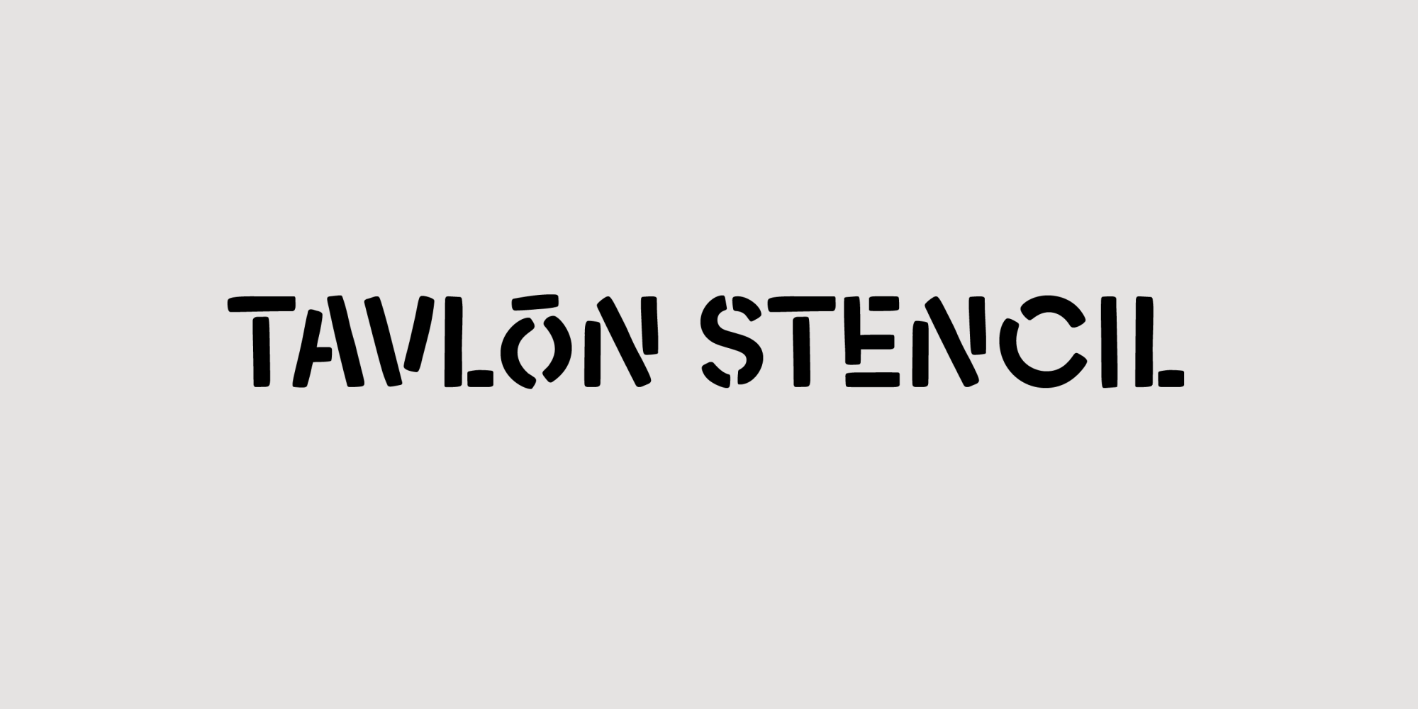
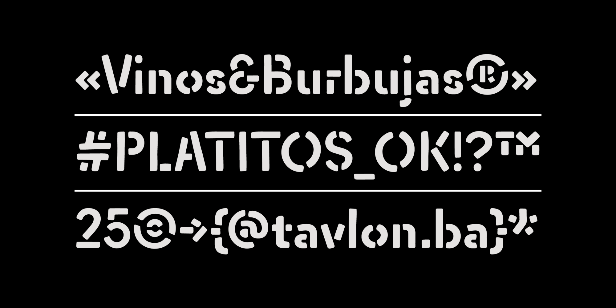
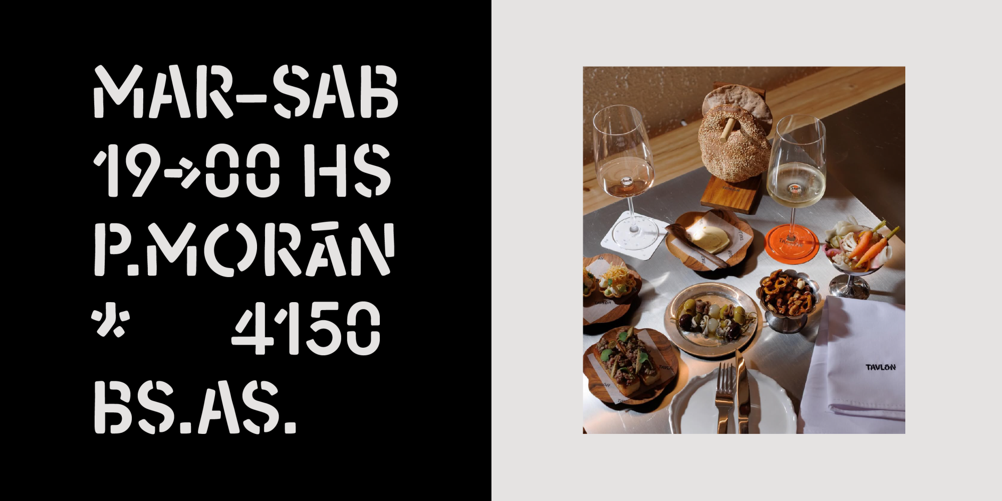
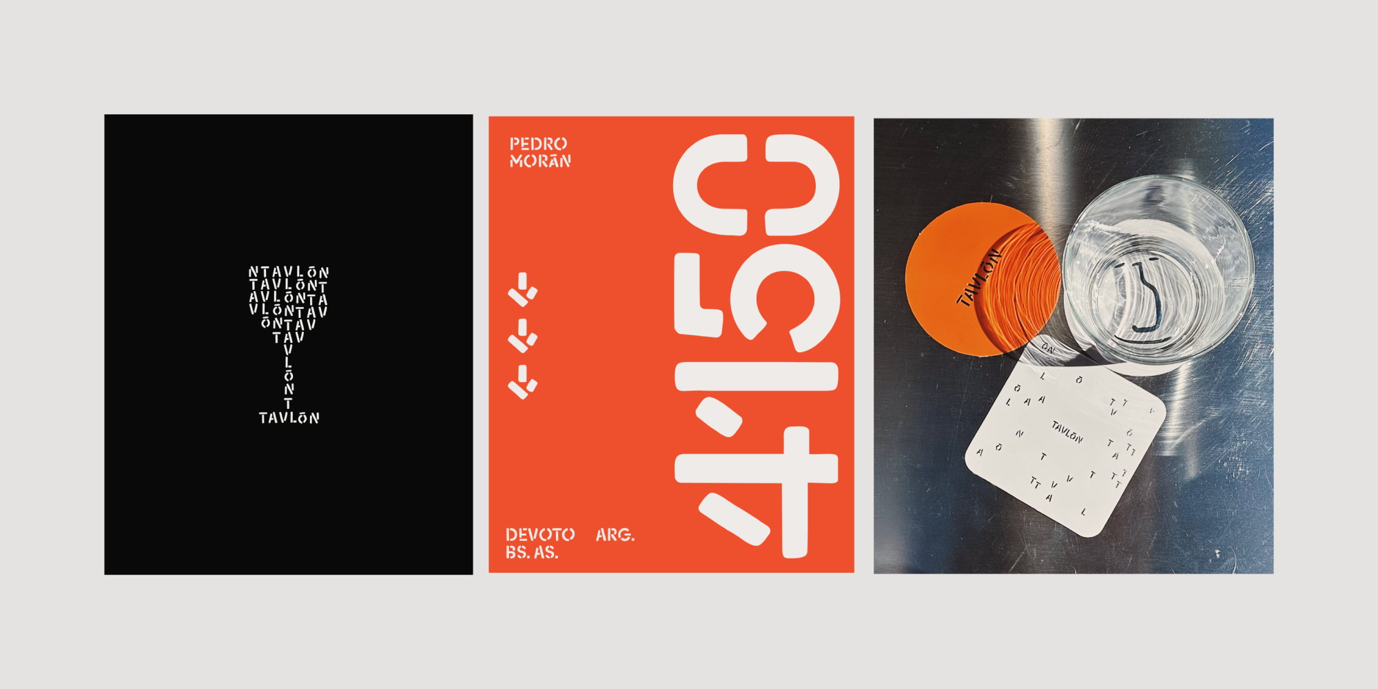
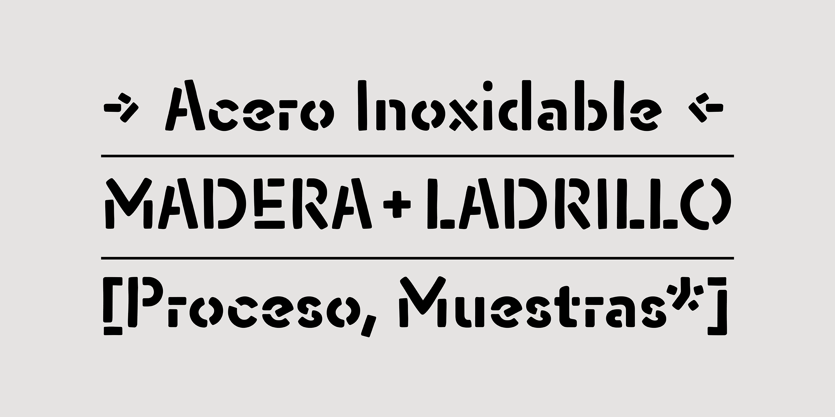
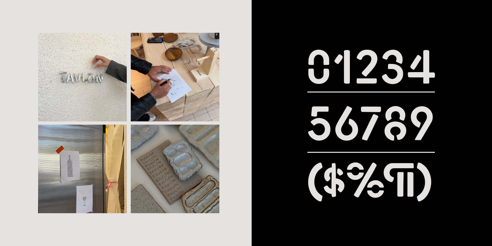
The typeface developed for Tavlón was born from the restaurant’s own spirit: a space where wine, seasonal cooking, and noble materials come together with precision. Drawing from stencil language and handcrafted processes, the letterforms recover the purity of essentials such as wood, steel, and brick.
Its construction takes on an architectural tone, with a modular system that echoes both structural joints and the way flavors and processes are assembled in the kitchen. The rhythm acts as a “window” into the material and the gesture, reminding us that behind what we see there is craft, method, and the hands that make it possible.
The result is a visual voice that accompanies Tavlón’s character: solid yet approachable, technical yet deeply rooted in materiality and the act of making.
- Art Direction
- Gabriela del Riego
- Client
- Tavlón
- Year
- 2025